You’re staring at a grid of colored squares showing your Google Maps rankings. Green in the middle, yellow at the edges, red everywhere else. What does it actually mean, and more importantly, what should you do about it?
A local SEO heatmap is a visual representation of your Google Maps rankings across multiple geographic points in your service area. It shows you where customers can find your business and where you’re invisible. Most businesses check their rank from one location and miss the complete picture. The heatmap shows you what’s really happening across your entire territory.
Why Reading a Heatmap Matters More Than Your Average Rank
Your average rank across your service area tells you almost nothing useful. A business with an average rank of 8 could be ranking #3 consistently everywhere (good) or ranking #1 in one spot and nowhere else (proximity wall problem).
The heatmap shows the pattern, not just the number. Patterns tell you what’s broken and what to fix. A proximity wall looks different from competitor dominance. Competitor dominance looks different from incomplete GBP setup. Each pattern requires a different fix.
If you’re managing local SEO for clients or running your own local business, reading these patterns correctly is the difference between fixing the actual problem and wasting months on changes that don’t move the needle.
The Anatomy of a Local SEO Heatmap
A heatmap displays your rankings on a grid of geographic points across your service area. GeoRankLand uses a 5×5 grid (25 points) or 7×7 grid (49 points) depending on your plan. Each point represents a location where a customer might search for your service.
The center point is typically your business location. The surrounding points spread outward at equal intervals (1km, 2km, or 5km spacing depending on your service area size).
Each grid square shows your rank at that location for your target keyword. The color indicates performance:
Green (ranks 1-3): You’re in the local 3-pack. This is prime visibility — most clicks go to these top three results.
Yellow (ranks 4-10): You’re in the expanded map results. Customers need to click “More places” or scroll, but you’re still findable.
Red/Dark: You don’t rank in the top 20 at this location. You’re invisible to customers searching here.
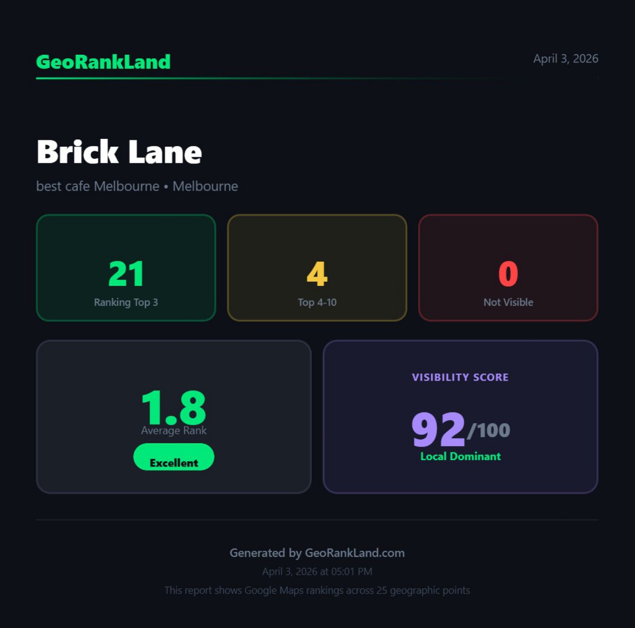
The Visibility Score tells you what percentage of grid points show you in the top 20. A score of 28/100 means you appeared at only 7 of 25 grid points. The other 18 showed you outside the top 20 or not at all.
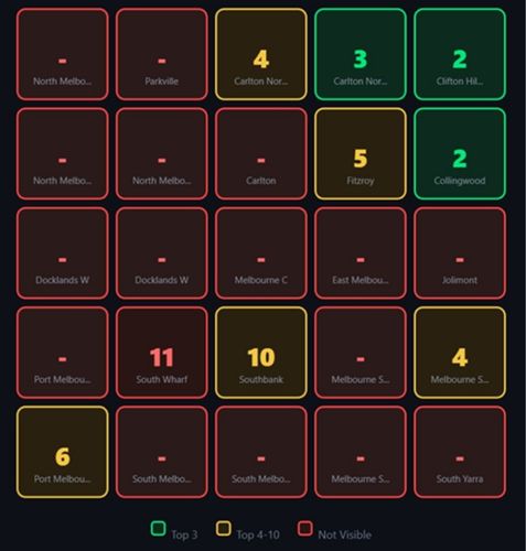
A 5×5 grid showing a Melbourne roofing business with green center (Ranks 1-3), fading to yellow (Ranks 4-10), and red/dark at outer edges (not visible).
This visual pattern indicates a proximity wall.
The Five Heatmap Patterns You Need to Recognize
Every heatmap falls into one of five patterns. Learn to identify these on sight and you’ll know what needs fixing before you read the Fix Report.
Pattern 1: The Proximity Wall
What it looks like: Green center, fading to yellow, then red/dark at the edges.
What it means: You rank well near your business location but your visibility decays with distance. This is the most common problem for local businesses with weak territorial signals.
Real example: A roofing business in Melbourne’s inner north (scanned April 2026) showed Rank #1 at their location, Rank #2 one kilometer out, Rank #9 at two kilometers, Rank #15 at three kilometers, and not visible beyond four kilometers. Visibility Score: 28/100.
The fix: Extend your signals across your service area. Build review volume, create location-specific content, add service area settings, and earn local citations.
Pattern 2: Competitor Dominance
What it looks like: Your business appears sporadically (scattered green/yellow squares) while one competitor appears at most grid points.
What it means: A competitor has stronger territorial signals than you do. They’ve solved the proximity wall problem. They appear across the broader area while you only show up in pockets.
How to spot it in the Fix Report: The competitor section will show one business appearing at 14+ of 25 grid points. That business has higher review count, better category optimization, or stronger location-based content than you.
The fix: The Fix Report tells you exactly what that competitor has that you don’t. Match their review volume, categories, and content coverage to compete.
Pattern 3: The Donut Hole
What it looks like: Red/dark center square, green or yellow surrounding squares.
What it means: You rank better away from your business location than at it. This happens when your GBP address is incorrect or when a competitor with the exact same name is at your address.
Why this happens: Google sometimes shows businesses with identical or similar names at the center point instead of your business. Or your GBP address doesn’t match where Google thinks you actually operate.
The fix: Verify your GBP address is correct. Check for name conflicts with other businesses at your location. Ensure your website, citations, and GBP all show the same address.
Pattern 4: Directional Bias
What it looks like: Strong performance (green/yellow) on one side of the grid, weak performance (red/dark) on the other side.
What it means: Your signals are concentrated in one direction from your location. This often happens when your service area content, citations, or reviews mention specific suburbs in one direction but not others.
Example pattern: Green to the north and west, red to the south and east. You probably have content mentioning northern suburbs, reviews from customers in that area, and citations from directories covering the north side.
The fix: Balance your territorial signals. Create content for underperforming areas, encourage reviews from customers across your entire service area, and add citations from directories covering the weak quadrants.
Pattern 5: Complete Invisibility
What it looks like: Red/dark across most or all of the grid, maybe one or two scattered yellow squares.
What it means: Fundamental GBP or technical problems. You’re not ranking anywhere because Google doesn’t understand what you do, where you operate, or that you’re a legitimate business.
Common causes: GBP suspended, wrong category, service area not defined, NAP inconsistencies, or brand new listing without any signals yet.
The fix: Check GBP status first. Verify categories. Define service area. Build foundational signals (reviews, citations, website content). This is a 3-6 month rebuild, not a quick fix.
Pattern Recognition Shortcut:
Look at the center square first.
If it’s green and the edges are red, you have a proximity wall.
If the center is red but surrounding squares are green/yellow, you have a donut hole or address problem.
If everything is scattered with no pattern, you have competitor dominance or category issues.
Reading the Visibility Score
The Visibility Score is the percentage of grid points where you rank in the top 20. It’s calculated as: (grid points where you appear) ÷ (total grid points) × 100.
A 5×5 grid has 25 points. If you appear at 18 points, your Visibility Score is 72/100. If you appear at 7 points, it’s 28/100.
Visibility Score Benchmarks:
– 80-100: Excellent territorial coverage. You’re visible across your entire service area.
– 60-79: Good coverage with room to improve. Minor proximity wall in outer areas.
– 40-59: Moderate proximity wall. You’re invisible to half your market.
– 20-39: Severe proximity wall. Most of your service area can’t find you.
– Under 20: Critical issue. You’re only visible in a small bubble around your location.
The Visibility Score tells you severity. A score of 28 means you need urgent fixes. A score of 72 means you’re doing well but could optimize further.
Don’t compare Visibility Scores across different service areas or grid sizes. A 60/100 score in a competitive downtown area might be harder to achieve than an 80/100 score in a suburban area with weak competition.
What the Competitor Section Tells You
Below your heatmap, the Fix Report shows which competitors appeared most often across your grid. This section answers the question: who is beating me, and what do they have that I don’t?
Competitor dominance is measured by how many grid points show that competitor. If “Dimitri’s Roof Tiling” appears at 14 of 25 grid points and you appear at 7, they dominate your service area.
The Fix Report compares:
- Review count (they have 89 reviews, you have 12)
- Average rating (both 5.0 stars, tied)
- Grid dominance (they appear at 14 points, you appear at 7)
This tells you exactly what to prioritize. If they beat you on review volume but not rating, you need more reviews. If they beat you on grid coverage but have similar reviews and rating, they have better geo-grid optimization through service area content or citations.
Pay attention to competitors who appear at 10+ grid points but don’t appear at your center point. They’ve broken through the proximity wall. Study what they’re doing differently.
How to Use Rank Patterns to Prioritize Fixes
The pattern on your heatmap tells you what’s broken. Here’s how to translate patterns into action.
If you see a proximity wall (green center, red edges)
First priority: Review volume. Businesses with proximity walls usually have weak review signals compared to competitors dominating the outer grid.
Second priority: Service area content. Create pages for the suburbs where you’re showing yellow or red.
Third priority: Local citations. Get listed in directories specific to the areas where you’re invisible.
Timeline: Expect 60-90 days to see outer grid ranks improve from not visible to ranks 15-20, then another 60 days to push into top 10.
If you see competitor dominance (scattered green, one competitor everywhere)
First priority: Match their review count. Check the Fix Report to see the gap and close it.
Second priority: Match their category setup. If they’re using secondary categories you’re missing, add them.
Third priority: Study their website content. They probably have location pages or service area coverage you don’t.
Timeline: 90-180 days depending on how far behind you are on reviews.
If you see directional bias (strong north/west, weak south/east)
First priority: Create content mentioning the weak quadrants. If you rank well in northern suburbs but poorly in southern suburbs, build pages about serving the south.
Second priority: Encourage reviews from customers in weak areas. After completing jobs in underperforming zones, request reviews that mention the location.
Third priority: Citations from local sources in weak quadrants. A directory listing in a southern suburb helps your southern grid ranks.
Timeline: 30-60 days for content to get indexed and start influencing ranks, 90+ days for review and citation accumulation.
If you see complete invisibility (red everywhere)
First priority: Check GBP status, categories, and service area settings. Fix fundamental setup issues before building signals.
Second priority: Build foundational signals. Get 10-15 reviews, create core website content, add NAP to major directories.
Third priority: Wait. New GBPs or recently fixed GBPs need time to establish trust with Google.
Timeline: 3-6 months to go from invisible to competitive.
The heatmap doesn’t just show where you rank. It shows where you’re losing customers and what you need to fix first.”
Reading Rank Decay: The Numbers Behind the Colors
The colors are useful for quick pattern recognition, but the actual rank numbers tell you how urgent the problem is and how close you are to breaking through.
Rank #1-3 (Green): You’re in the “local 3-pack” (the map results above organic listings). This is prime visibility. Most clicks go here.
Rank #4-10 (Yellow): You’re in the expanded map results. Customers have to click “More places” or scroll, but you’re visible to people actively looking.
Rank #11-20: You’re buried but technically visible. Only customers doing deep research will find you. GeoRankLand doesn’t show these separately on the heatmap — they appear as red/dark (not visible) along with true nulls.
Not visible (Red/Dark): You don’t exist to customers searching here. Not in the top 20.
A heatmap showing ranks like 1, 3, 7, 12, 18, null, null, null indicates steady decay. You’re competitive close to your location but losing ground with distance.
A heatmap showing ranks like 1, 2, 2, 3, null, null, null indicates a sharp drop-off. You’re in the local pack for about half your service area and invisible for the other half. This suggests a proximity wall with a clear boundary.
A heatmap showing ranks like 5, 8, 6, 9, 7, 10 with no pattern indicates you’re consistently mid-pack everywhere. Your signals are spread evenly but not strong enough to dominate. Fix: boost overall authority (more reviews, better content, stronger backlinks).
What to Do When You See Blank Spots (Red/Dark Squares)
Red/dark squares mean you don’t appear in the top 20 at that grid point. You’re completely invisible to customers searching here.
These blank spots tell you where customers can’t find you at all. If half your grid is red, half your potential customers are hiring competitors because your business doesn’t show up in their search results.
Why blank spots happen
Google has insufficient confidence that your business is relevant to searchers in that area. You lack signals (reviews, content, citations) connecting your business to that geographic zone.
How to fill blank spots
Identify which suburbs or neighborhoods correspond to the red grid points. Create content mentioning those areas. Encourage reviews from customers in those locations. Get citations from local sources covering those zones.
Track the blank spots over time. After implementing fixes, run another scan in 30-60 days. Watch for red spots changing to yellow (you’re now visible in ranks 4-10), then green (you’re in the top 3).
Each red → yellow transition means Google is starting to see your business as relevant to that area. Keep building signals until those ranks climb into the top 3.
The Manual Heatmap Check (No Tool Required)
If you don’t have a geo-grid rank tracker, you can manually check key points to spot obvious problems.
Manual Heatmap Check Process:
- Open Google Maps in incognito window
- Search your keyword from your business address → note rank
- Change location to 2km north → search → note rank
- Change location to 2km south → search → note rank
- Change location to 2km east → search → note rank
- Change location to 2km west → search → note rank
- Repeat at 5km in each direction
Pattern check: If ranks decay steadily (1, 5, 12, null) = proximity wall. If scattered (1, null, 8, 3, null) = competitor dominance or spotty signals.
This gives you a rough 9-point grid (center + 4 directions at 2km + 4 directions at 5km). It’s not as comprehensive as a 25-point scan, but it’s enough to identify whether you have a proximity wall, competitor dominance, or directional bias.
Tracking Progress: How Heatmaps Change Over Time
Reading a single heatmap tells you what’s wrong. Comparing heatmaps over time tells you whether your fixes are working.
Run a baseline scan today. Implement fixes for 30-60 days. Run another scan. Compare the two heatmaps side by side.
What good progress looks like:
- Red squares turning yellow (now ranking 4-10)
- Yellow squares turning green (now ranking 1-3)
- Visibility Score increasing from 28 to 44 to 56
- Outer grid points showing improvement while center points stay strong
What stalled progress looks like:
- Same number of red squares after 60 days
- Ranks unchanged or fluctuating randomly
- Visibility Score within 5 points of baseline
- Center point ranks drop while trying to improve outer points
If you see stalled progress, you’re either fixing the wrong things or not implementing aggressively enough. Check the Fix Report again. Are you matching competitor review volume? Did you actually publish service area content or just plan to? Did citations get submitted and approved?
Progress Tracking Tip:
Screenshot your heatmap every 30 days.
Create a folder with dates (2026-04-15, 2026-05-15, 2026-06-15).
Visual comparison across 3-4 months shows whether changes are working better than trying to remember what the grid looked like last month.
Common Heatmap Misreads (And How to Avoid Them)
Misread #1: “My average rank is 8, so I’m doing fine”
An average rank of 8 could mean you rank #8 everywhere (decent) or you rank #1 at your location and nowhere else (proximity wall). The average hides the pattern. Read the heatmap, not the average.
Misread #2: “I have one green square, that’s good enough”
One green square at your business location while everything else is yellow or red means you’re only visible to people searching from your street. That’s a severe proximity wall, not a success.
Misread #3: “The competitor has more reviews so I can’t compete”
Check where they appear on the grid versus where you appear. If you both appear at the center but they dominate the outer points, the issue might not be review volume — it could be service area content, citations, or categories. The Fix Report shows the real gap.
Misread #4: “I rank well in one suburb so my SEO is working”
Local SEO for dentists (or any local business) isn’t about dominating one suburb. It’s about being visible everywhere you operate. A heatmap that’s green in one quadrant and red everywhere else means you’re losing 75% of your market.
Misread #5: “My heatmap looks bad but my phone shows me at #1”
Your phone shows you the results from wherever you’re standing when you search — probably your office or home. The heatmap shows you the results from where your customers are standing across your entire service area. Trust the heatmap, not your phone.
Reading Heatmaps for Different Business Types
Service Area Businesses (Plumbers, Electricians, Roofers)
You need even coverage across your entire service area. Look for proximity walls and directional bias. You should rank similarly 5km north, south, east, and west of your location because you service all those areas equally.
Red squares are especially costly because service calls are high-value. One red grid point might represent an entire suburb where you’re invisible to emergency customers.
Priority: Balance your heatmap. Every quadrant should show yellow/green coverage.
Physical Location Businesses (Dentists, Lawyers, Retail)
You need strong coverage in a tighter radius (2-5km) but can tolerate weaker outer coverage if customers don’t typically travel far.
A proximity wall at 3-4km is less critical than one at 1-2km. Patients aren’t driving 10km for routine dental work, but they might drive 3km.
Priority: Dominate the area immediately surrounding your location. Outer grid points matter less unless you’re in a low-density area.
Mobile Businesses (Food Trucks, Mobile Mechanics, Cleaning Services)
Your heatmap should show where you actually operate, not just where your mailing address is. If you’re set up as a service area business hiding your address, your heatmap might be scattered.
Red squares in areas you regularly service indicate GBP service area settings need adjustment or you need location-specific content.
Priority: Match your heatmap coverage to your actual operation zones. If you work across three cities, you should have decent coverage in all three, not just one.
Your Next Step
Pull up a heatmap of your business or your client’s business. Look at the pattern first, then the numbers, then the competitor section.
Ask yourself:
- Do I have a proximity wall (green center, red edges)?
- Do I have competitor dominance (scattered squares, one competitor everywhere)?
- Do I have directional bias (strong one side, weak the other)?
- Are there red squares where I should be visible?
Once you identify the pattern, you know what to fix. Proximity wall = extend signals. Competitor dominance = match their volume. Directional bias = balance coverage. Red squares = build presence in those areas.
Run a scan every 30 days to track whether your fixes are moving the grid in the right direction. The heatmap is your diagnostic tool and your progress tracker.
Run a free scan at georankland.com— no account required to see your heatmap and Visibility Score.